[You can see Prize List & Digest Movie] CDA Design Competition
Hello, everyone!
Car Design Academy launched a new program, a Monthly Design Competition. Any of students, either Japanese program, or English Program can participate. The first competition was held in July. Our new instructor, Yamashita-san, who designed Nissan Fair Lady Z has chosen a Design Theme. A theme for July was “Crossover/SUV for Tokyo, which will debut in 2018” (See more information about Mr. Yamashita, click here).
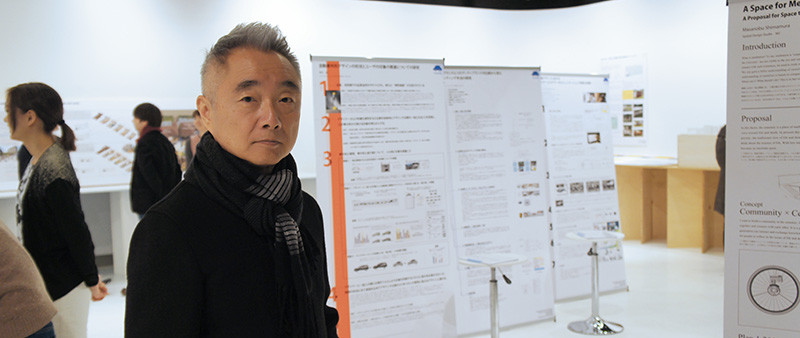
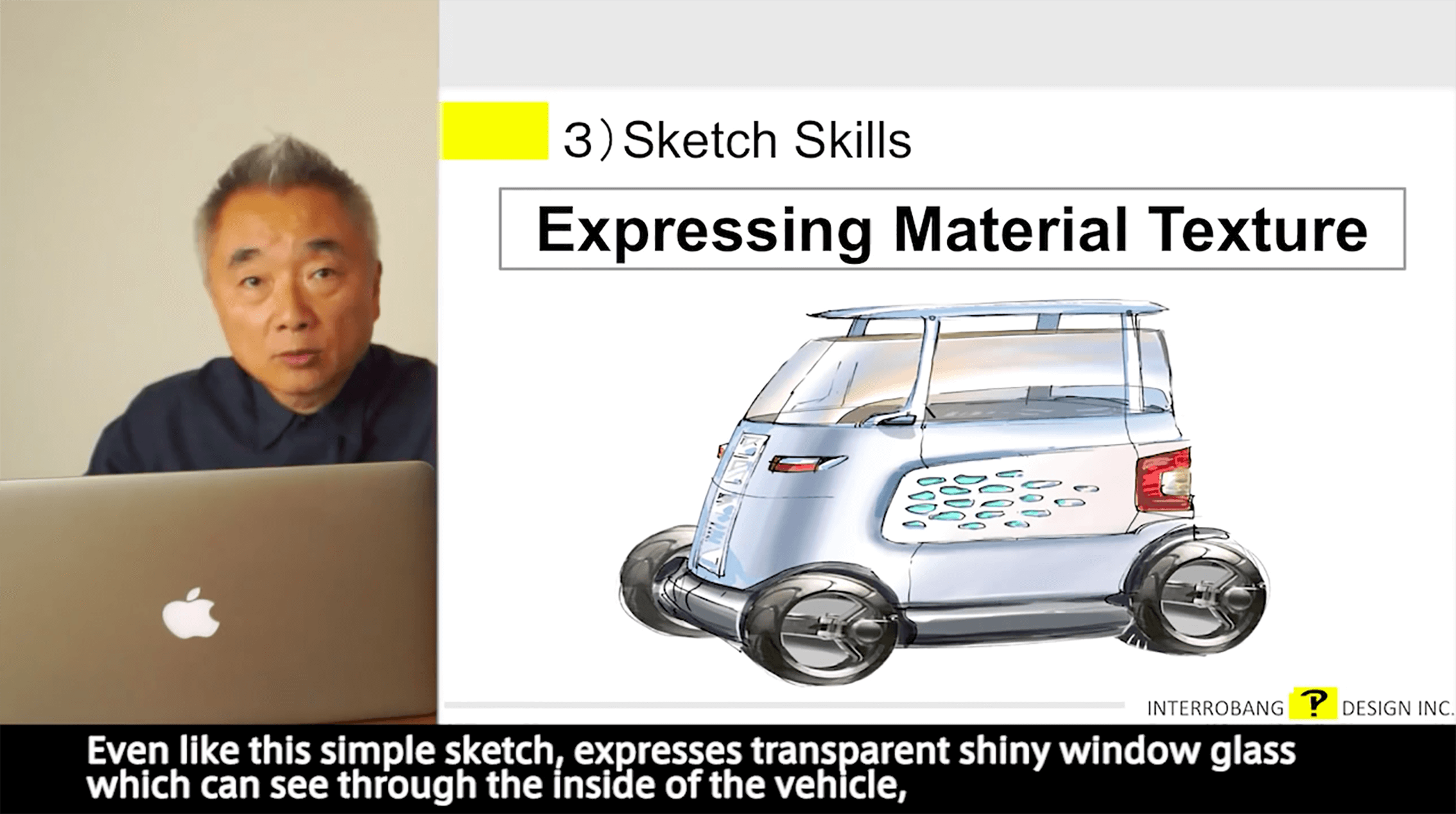
Born in 1949 in Fukuoka City, Japan. Joined Nissan Motor Co. as a car designer in 1968. His first work in Nissan was second generation of Violet. After he involved several other Nissan models, he was mandated to manage major Nissan flagship models such as the project of Fair Lady Z-Z32, Skyline GT-R, Infinity G35, and Q45. He was invited to have his design class, Transportation Design, at Tokyo Metropolitan University in 2008. In June 2015, he established his own design company, INTERROBANG DESIGN INC. He is actively managing his new born design company to do “Design Development”, “Design Consultant”, and “Raising New generation Designer.”
You will be able to get more detail stories how he managed to do all those big projects in Nissan from this link.
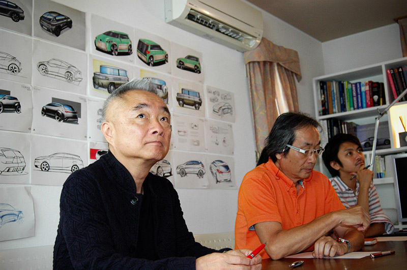
Here we are going to introduce about the competition. You can also see award list and enjoy their works today!
This competition was aimed to encourage students for acquiring skills and strong mentality for win the competition. Therefore, the competition is more similar to the real world competition in the case when students will face once after they join automobile companies or design houses.
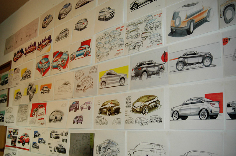
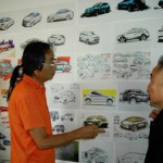
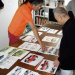
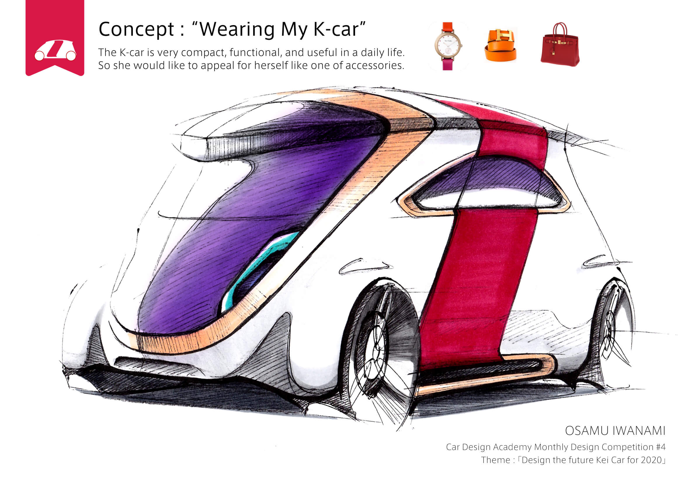
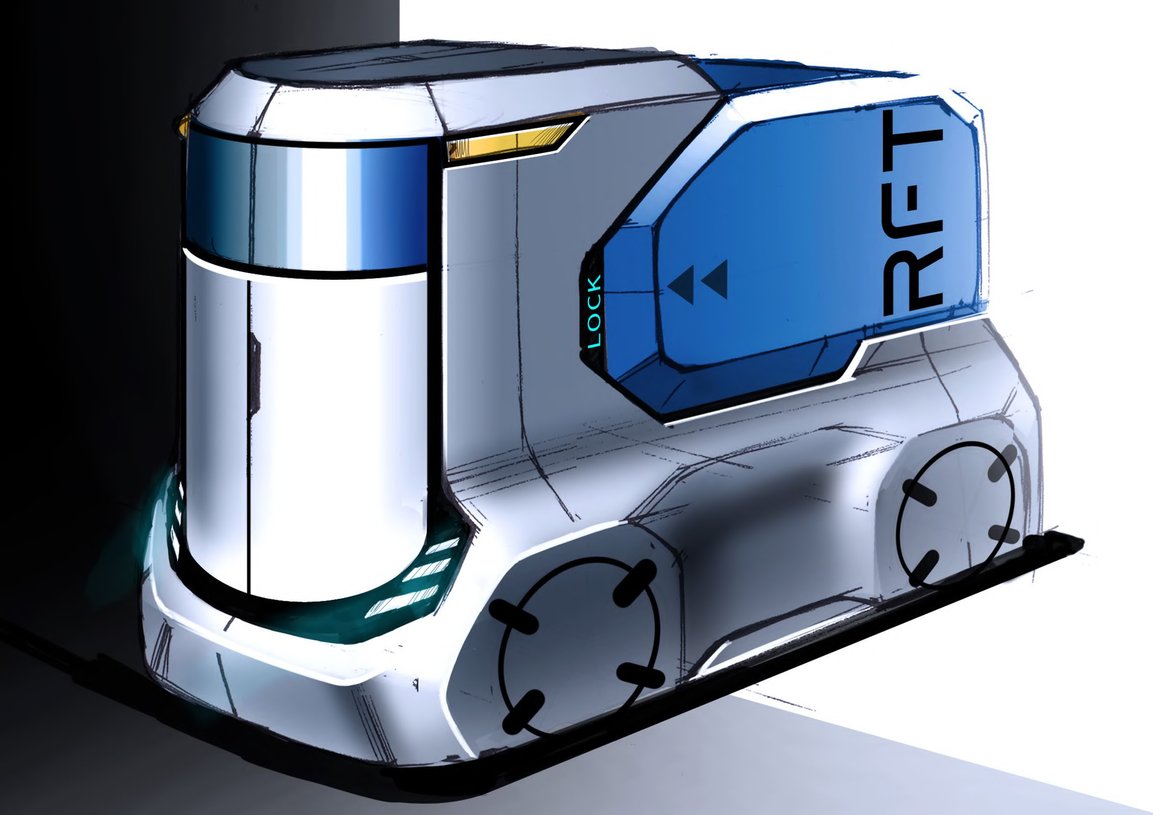
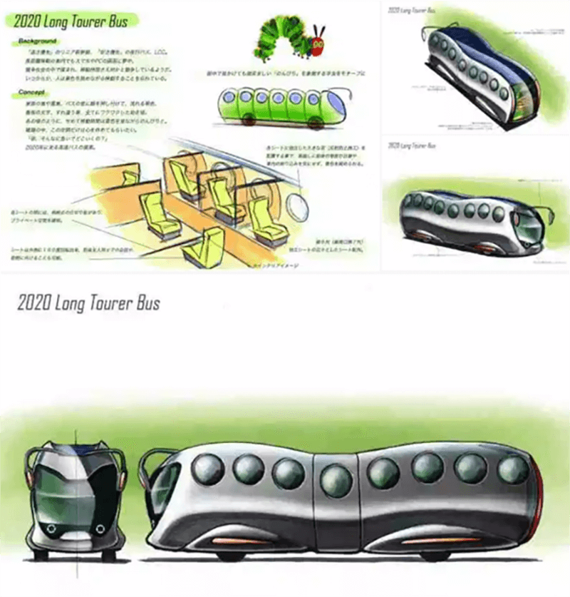
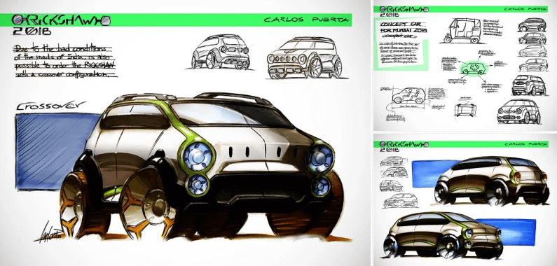
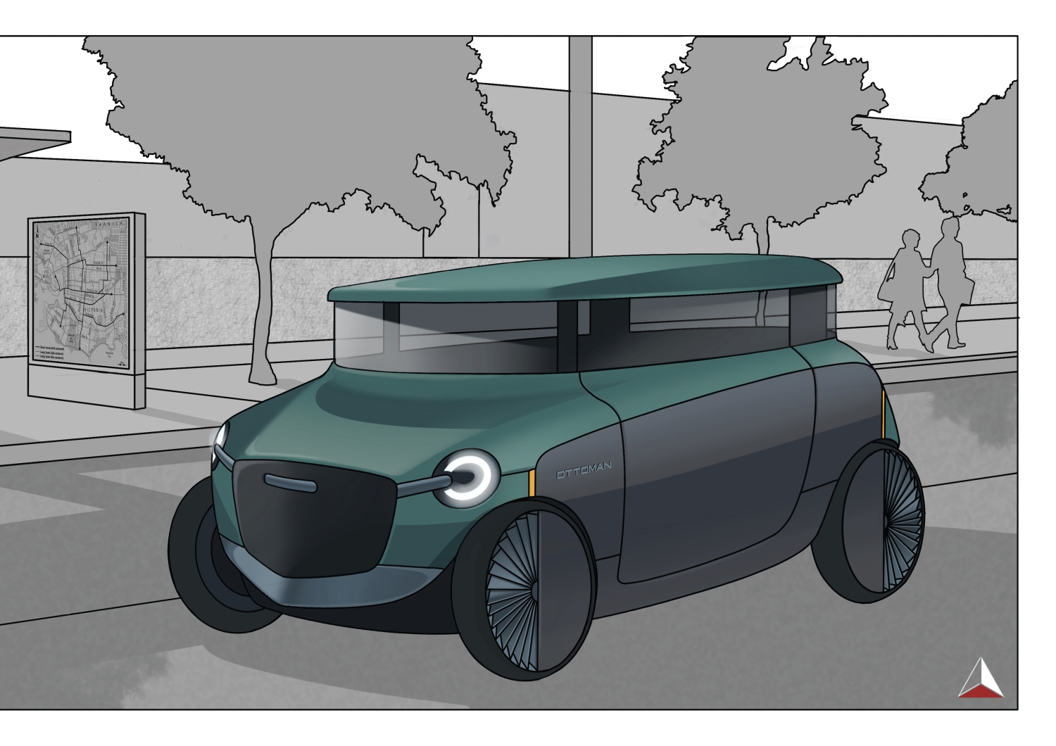
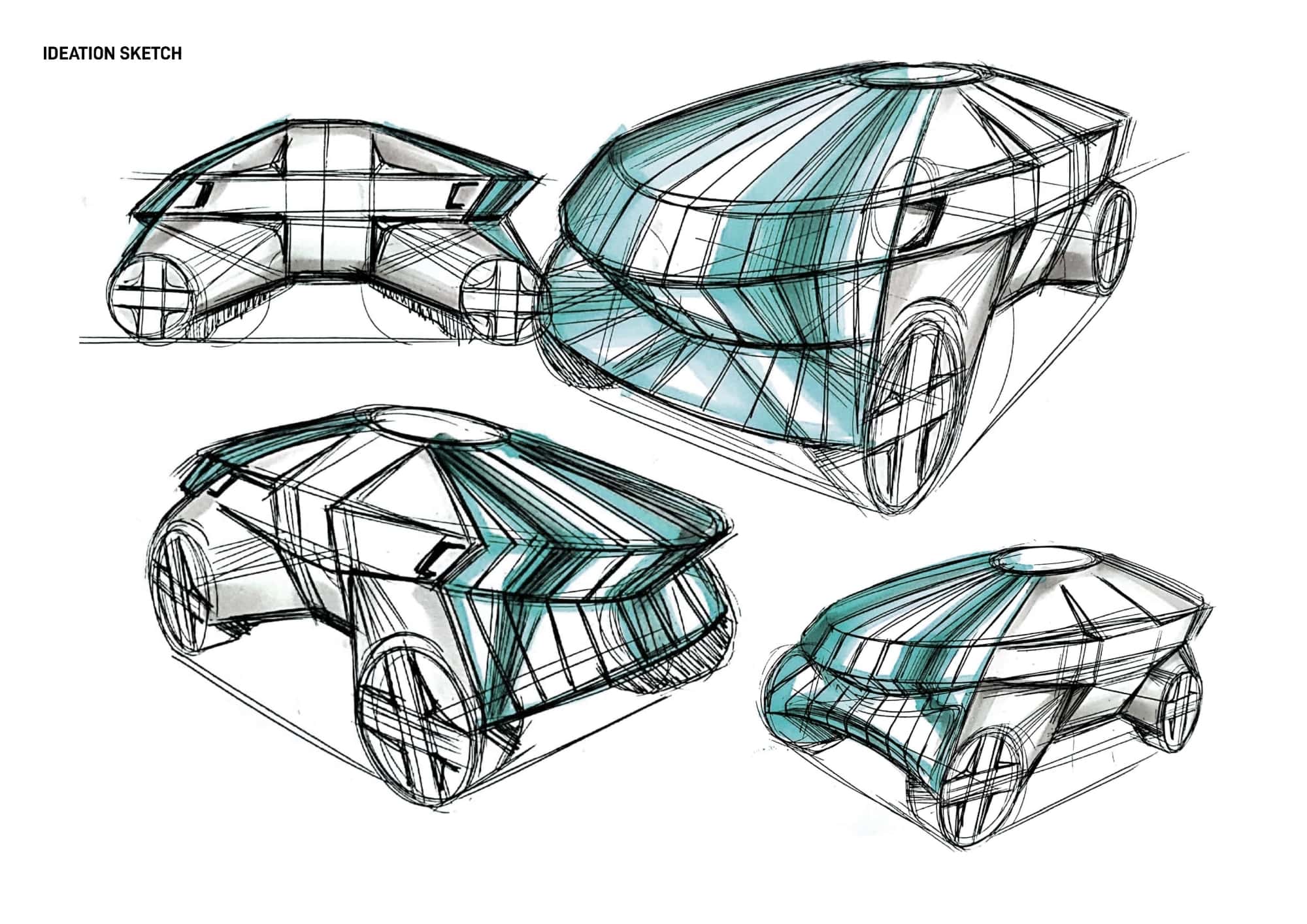
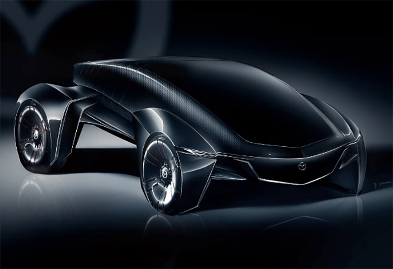
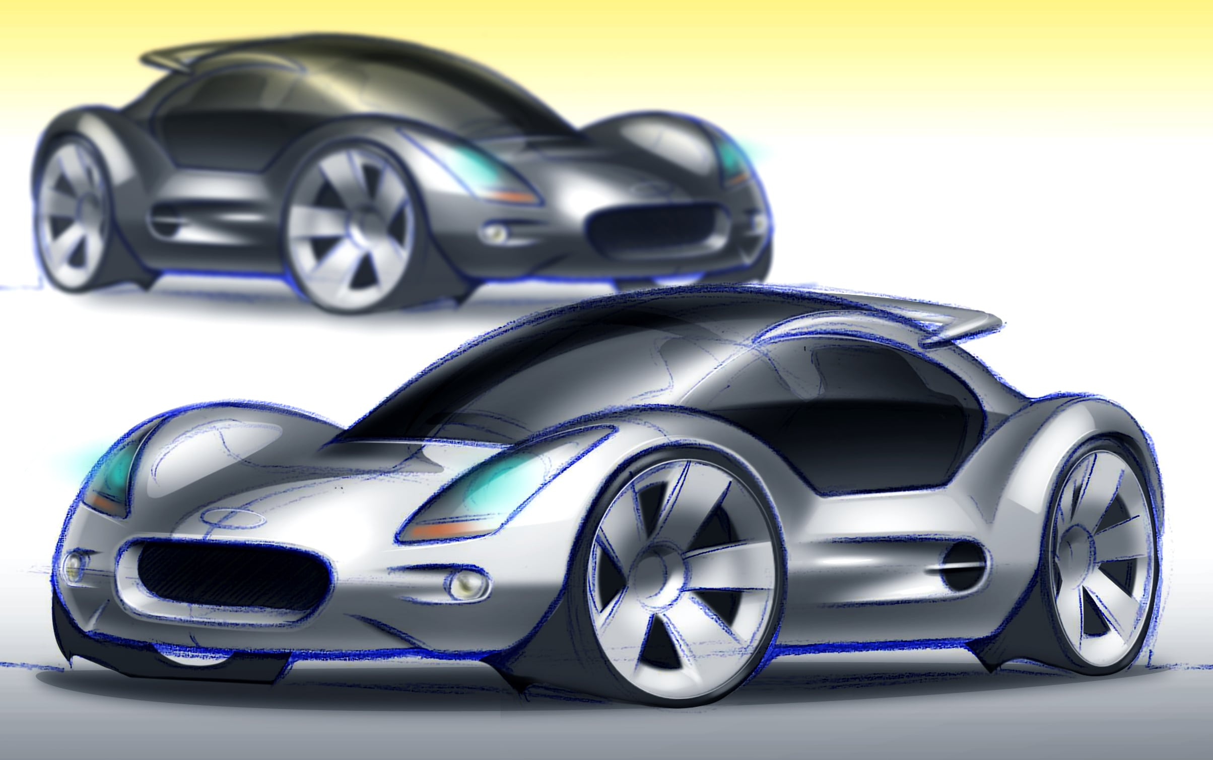
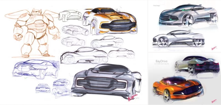
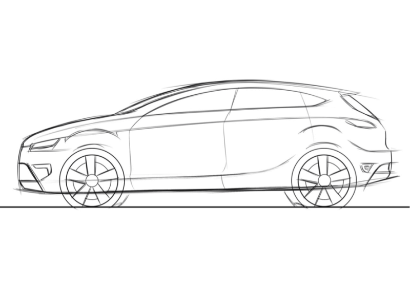
These are some entry sketches by students.
Not only Japanese students, but also all students in the world are competing together.
What are the criteria for the judging of this competition?
Mr. Yamashita sets the criteria as;
1. Attractiveness 2.Originality (idea) 3.Skills(line, 3-D, perspectives)
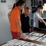
Evaluation was done by Mr. Yamashita and other instructors.
Mr. Yamashita often said during the evaluation that he would like students to know what a successful sketch is in the competition, because he has a long experience both side; creating presentation materials as a designer when he was working in Nissan and evaluating presentation materials as a project manager.
<Prize List>
FIRST PRIZE Osamu Iwanami
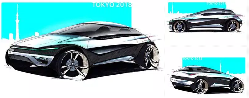
<Comment>
Very clear and bold design. Simple form and modulated contrast sketch. I have an good impression for this. In the future I would like to see new proposal in the front face. (Yamashita)
This is an awesome design. Proposed new proportion, Originality, and Sporty appearance is an outstanding work. You have adopted sharp wedge like design features, which exceeded other students’ works level. (Nori)
High level of pursuing the originality. Quality of Line Drawing and Contrast on coloring was exceeding other works. However, the small Roof raised my concern. As for sketch skills, the inclination angle of Front Window between Front View and Side View needs to be corrected. (Can)
SECOND PRIZE Predrag Stajic Strandhag
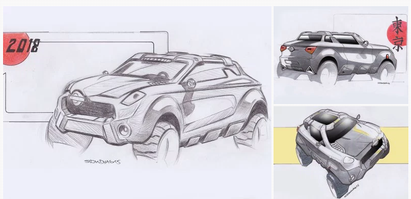
<Comment>
The Proportion is Unique and gives us a powerful impression, which leads to feel that this car is exploring the new category. Very easy to figure out the vehicle’s 3-D form. It is an attractive proposal for new generation. When compared to the uniqueness of Side View, Front design is not that much. Need to propose something new, particularly having mind of car as 3-D objects. (Yamashita)
Nice view sketch. Both Roof and Pillar shape are unique which is proposing your design intention, that I liked. Gives us a powerful impression of SUV. Solidness is well expressed. I find his sketch level is very high. (Nori)
The shape, setting the view angle, you have a good technique how to show your design in a better way. Design itself is very unique and seeking new character. One area to further improve is you exaggerated to show the Cabin very small (deformation). If you try to draw sketch a little more realistic, then you can leap. (Can)
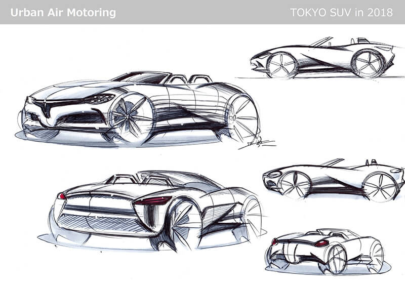
THIRD PRIZE Masanori Okahashi
<Comment>
If the theme were sports car your idea is well expressed, but as for crossover-SUV, I think you need to create an extra additional element in your design. Overall the style of car is good, but feel concept was not considered. (Yamashita)
The image of SUV has faded. But I like your stance to challenge to create new shape. My advice is just raise the overall height a bit more, then it will look like an SUV. (Nori)
Your idea is Open car plus SUV, which is very unique. The harmony between the declining line from Hood to Rear Tire and the ascending line from Rear Tire to Front is nicely designed. As for sketch, there are some lines are not clear whether those are section or reflection, which should be more clear. (Can)
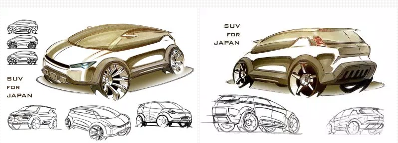
FOURTH PRIZE Carlos Puerta Mascaró
<Comment>
You have expressed the vividness that you created in idea sketches into the rendering sketch. Good job. Particularly you have created your originality by drawing one-stroke from Front to Rear. (Normally it will look like some other existing car, but yours created and kept the originality.) In the future you need to practice more drawing accurate in Perspective. (Yamashita)
Dressy elegant SUV is well expressed. Can give a nice impression with this friendly design. (Nori)
A car as one large object is well expressed. Very characteristic Belt Line create a design theme and make it one, that gives us a good impression. As for sketch, I find your Perspective is slightly off, particularly, width of Tire. It should be further examined from the relationship of view angle. (Can)
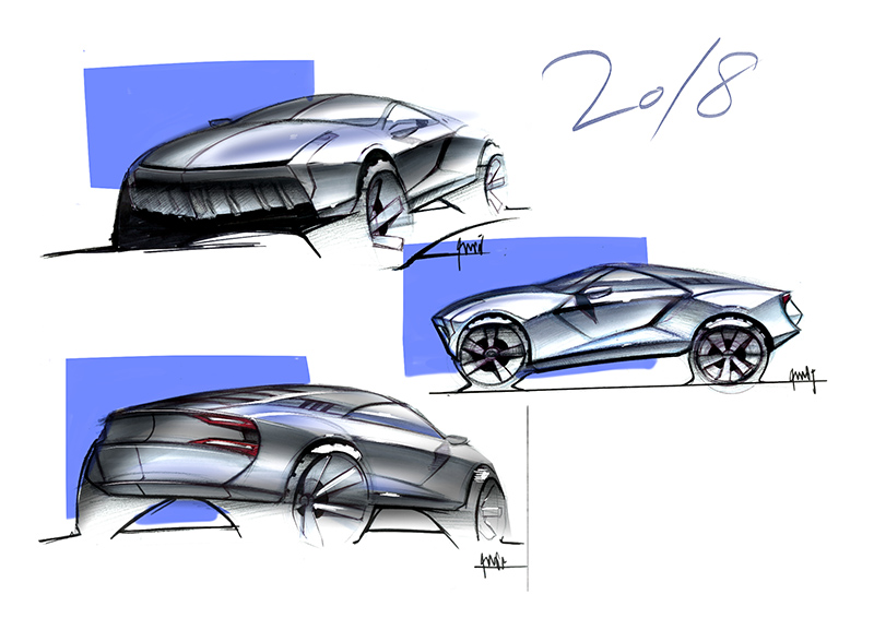
FIFTH PRIZE Kazuki Sakurai
<Comment>
Design intention is very clear, that is good. You are successful to create category for this SUV. Compared to Front and Side view, your Rear view is not clear. Need to raise your eye-point and express them more accurately, that is definitely you need to learn. (Yamashita)
It shows a vivid momentum of the vehicle. I find that there should be difficult to ride this car by seeing your side view. If that is cleared, it would be much better. As for originality, your Front face and Rear face need to be reviewed. (Nori)
When I look at your Side view, I find that the proportion balance was an interesting proposal. What your design intention is clearly communicated, that I valued. However, your front face and rear end designs are lacking originality. Not satisfied. Need to propose extra which will differentiate your design. (Can)
We guess that some of students got disappointed after the announcement of prize; however if you became a professional car designer, like this experience will be often happened. Thinking “why you were not chosen” and to get something from this experience are significant. It will make you moving toward to win the competition.
Finally, here is the digest movie from the competition.


