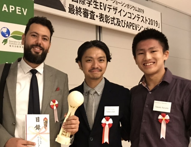
#3 Award announcement | Theme / Long Distance Bus in 2020
Hello, everyone!
Car Design Academy’s #3 Monthly Design Competition theme was held in the end of November, ” Long Distance Bus in 2020.”
Total 43 students have participated this time. (27 Japanese students and 16 global students), and more than 50 works have come up for the contest. Every one has squeezed a various interesting idea.
CDA Monthly Design Competition is an arena where all existing and graduate CDA students will compete under one Design Concept to propose his or her ideas. Evaluation Criteria are “Design Originality”, “Design Attractiveness”, and “Sketch Skills.” Evaluaters are 3 CDA instructors. Mr. Yamashita who designed Nissan FairLady Z is responsible for Design Competition program.
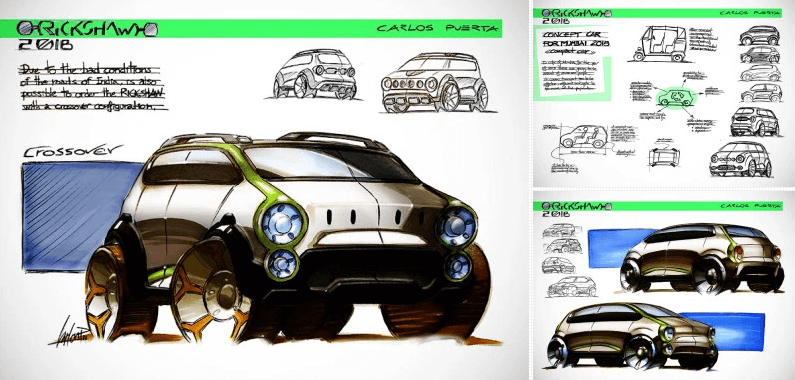
If you are interested to see the #2 competition results, please take a look for the link below. A theme for Sept. was “A Compact Car for Mumbai in 2018” (See more information about Mr. Yamashita, click here).
#3 Theme 「Long Distance Bus in 2020」
Prize List
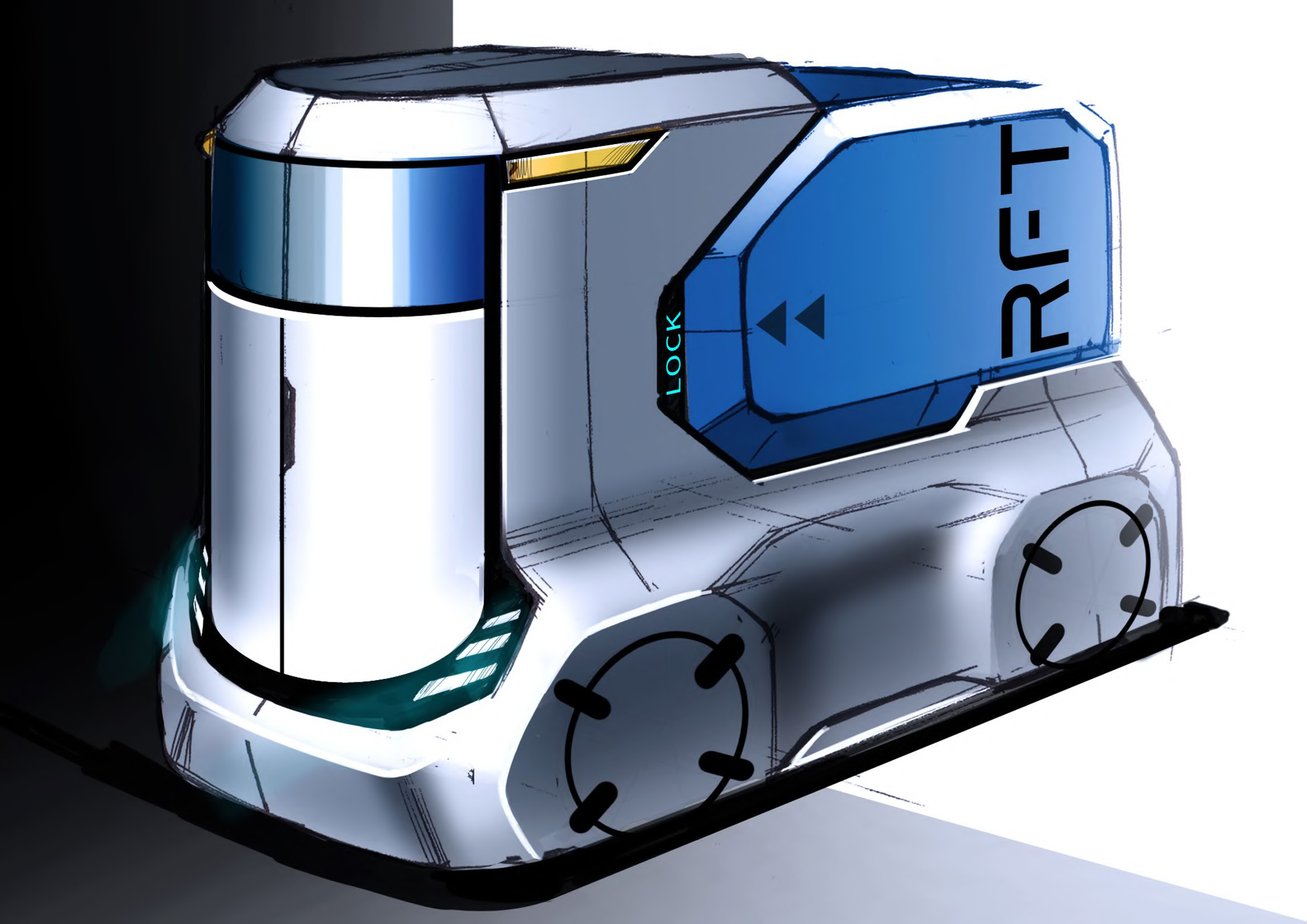
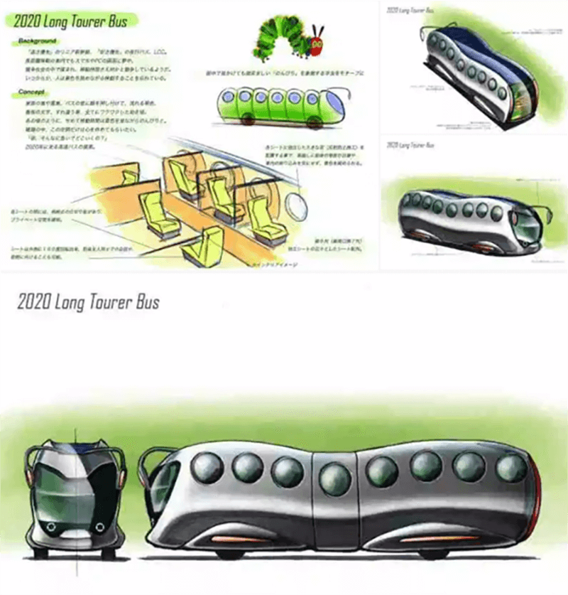
FIRST PRIZE / Kenji Tanaka
<Comment>
I do think that the balance of Concept, Exterior, and Interior are well-balanced and expressed them at the very high level. One reason I selected this is because designer has paid attention for the role of bus in the society. (Mr. Matsuyama)
Very high level form and it is unique and humorous. Concept is deeply examined. The next job is to pursue the design as a product design. (Yamashita)
Both shape and concept are highly organized. It was really an enjoyable proposal.(Nori)
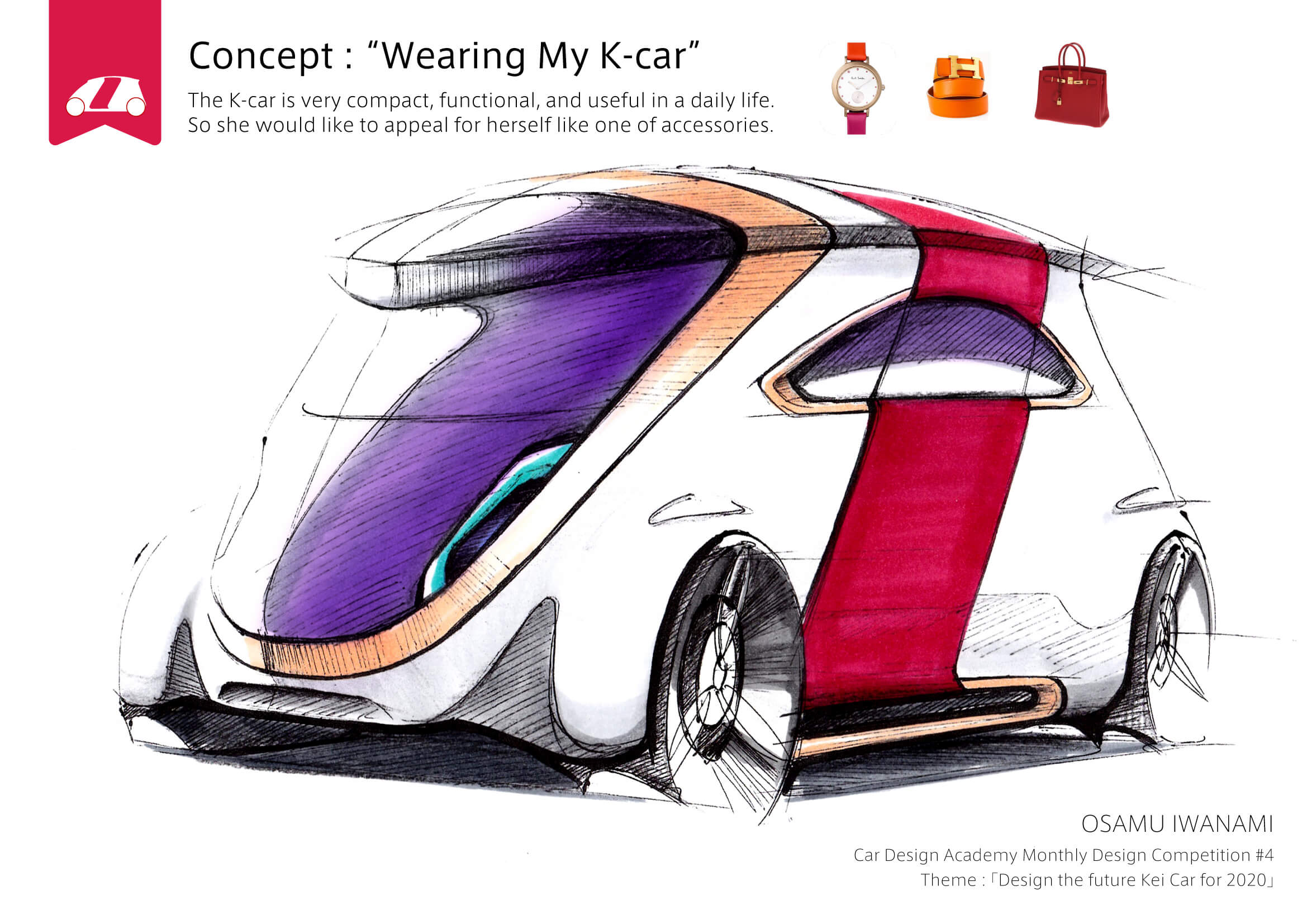
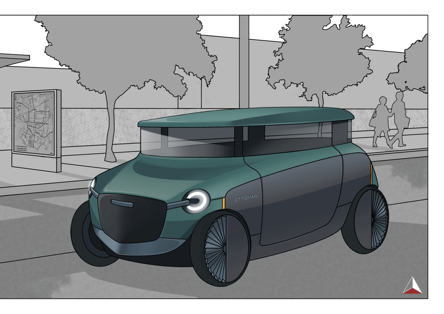
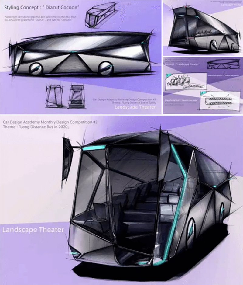
SECOND PRIZE / Osamu Iwanami
<Comment>
The bus is just a long rectangle box. In this competition, I found many participants have tried to get out of that box image. This proposal did not lose the balance by over-focusing multi-dimensional shape. It has proposed the joyfulness of passengers by showing interior. The balance between contents of proposal of exterior form and interior are at the high level. (Mr. Matsuyama)
Fascinated by the design theme and interior concept. The next work is to pursue more for exterior design shape. Particularly I believe that front face design needs to be revisited. (Yamashita)
I would prefer to be more simplistic exterior form. The functional aspect and interior form is rational. However, I think more simple exterior design still be able to communicate your design intention.(Nori)
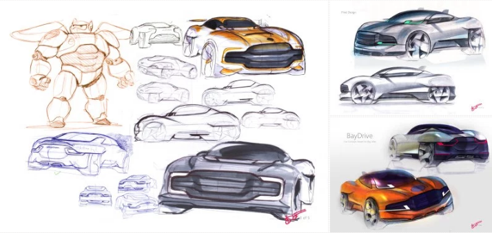
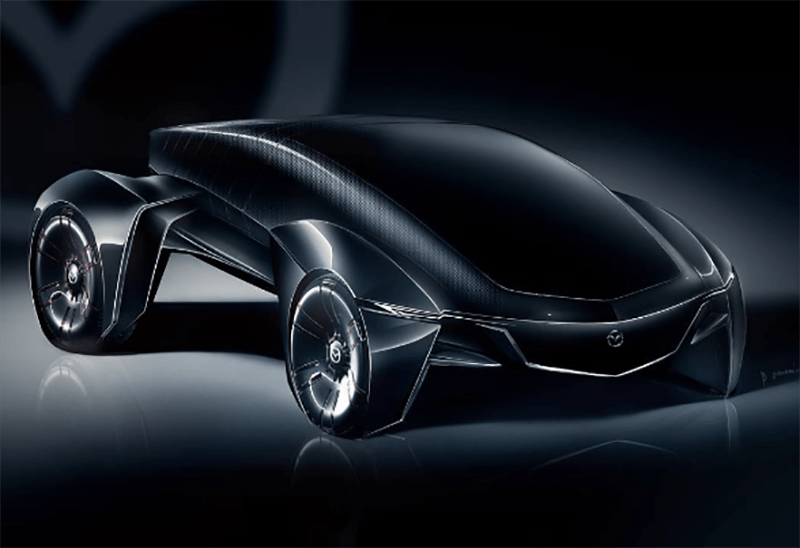
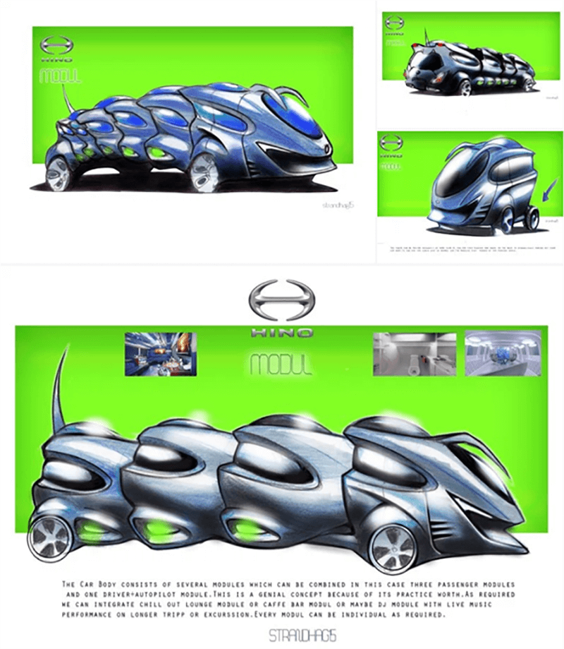
THIRD PRIZE / Predrag Stajic Strandhag
<Comment>
Humorous and unique design. There shall be no functional performance issue coming up. Also very high level sketch quality. (Nori)
Dessin skill is very high. The proposed form is interesting. The next is to complete the design as a product design.(Yamashita)
I like this cute form and it looks nicely fit into the street. (Can)
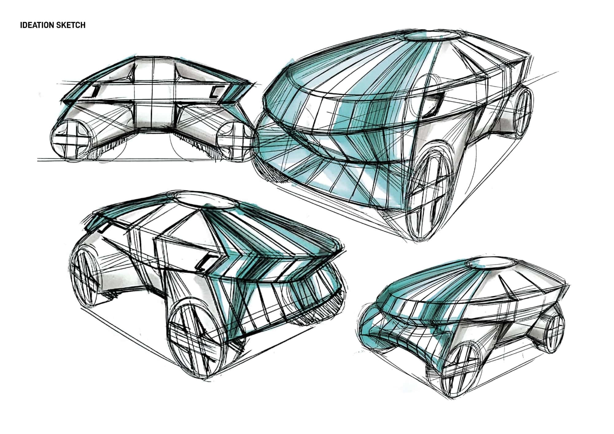
<FOURTH PRIZE / Alireza Saeedi >
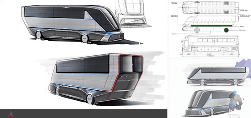
<Comment>
Very articulate expression. The problem is the rear shape, and if you modify this area, it will be much further better. (Nori)
The communication skill by the sketch is very persuasive. Concept is good, but the rear shape, inversed inclining seems to me odd. (Yamashita)
Fantastic rendering skill. But dissatisfied with the idea creation. (Can)
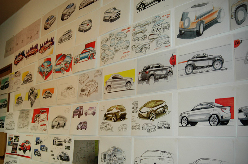
Works of other students


