The Most Common Mistakes That Students Make in Their Car Sketches – 3. Perspective
We will have a series of “What are the most 4 common mistakes when students draw car sketches.” Drawing car design is not an art. The sketch you are going to draw is a tool to communicate your idea in your brain on the 2D paper by showing 3D sketches. In Car Design Academy, we noticed some common mistakes or errors done by many students. I will explain these by showing examples.
2. Lines-Vividness, Waving lines, Thickest line
3. Perspective (1) HL and VP
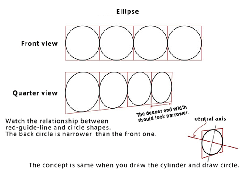
4. Drawing Tires Ellipse
3. Perspective: Two Vanishing Points (VP) are not on the Horizontal Lines (HL)
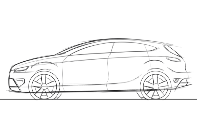
Accurate Perspective drawing is the key to express the object in 3D format. The inaccurate Perspective drawn sketch will be so obvious, and the shape looks odd.
The main theory of Perspective is the object which placed far from the viewer looks smaller than the object which is near side. So, if you draw object on the far side is same or larger size than the near side, it is wrong.
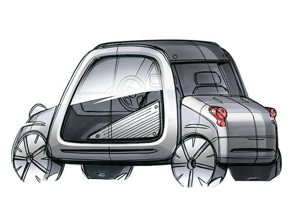
Bad Example (1) Lines not reaching the vanishing point.
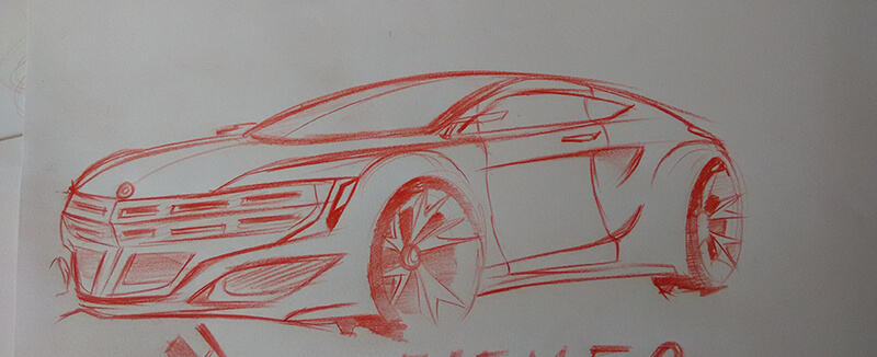
Horizontal Line is basically at your eye level. There are 3 kinds of Perspective. Single Point Perspective, Two-Point Perspective, and Three Point Perspective. Point means Vanishing Points. The most typical Perspective used in car design is Two Point Perspective. The most frequently seen mistake is 2 VPs are not on the HL. This means one of the line which is consisting Perspective, that angle is distorted.
Bad Example (2) VP is not on the HL.
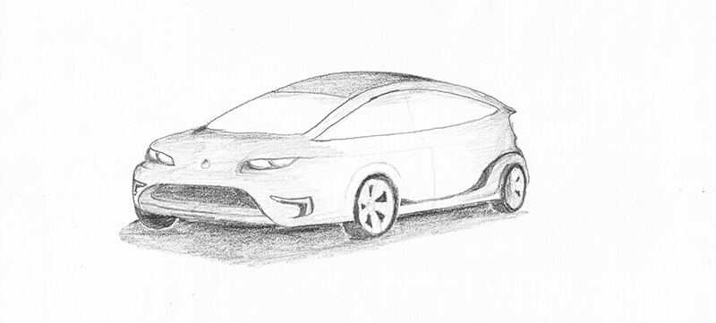
How it should be.
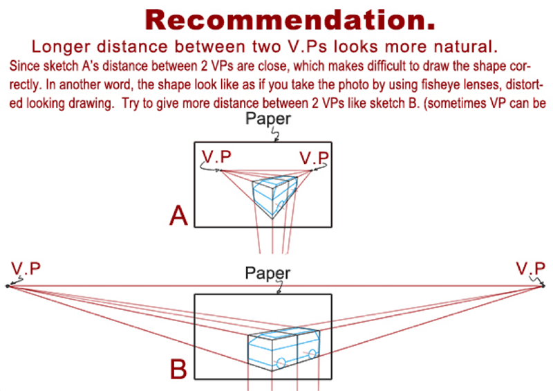
(Excerpts from Car Design Academy Lesson 2 material)


