The Most Common Mistakes That Students Make in Their Car Sketches – 1. A-Pillar Inclination
We will have a series of “What are the most 4 common mistakes when students draw car sketches.” Drawing car design is not an art. The sketch you are going to draw is a tool to communicate your idea in your brain on the 2D paper by showing 3D sketches. In Car Design Academy, we noticed some common mistakes or errors done by many students. I will explain these by showing examples.
1. A-Pillar Inclination
2. Lines-Vividness, Waving lines, Thickest line
3. Perspective (1) HL and VP
4. Drawing Tires Ellipse
1. A-Pillar Inclination
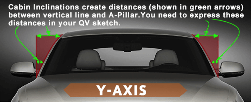
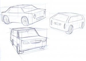
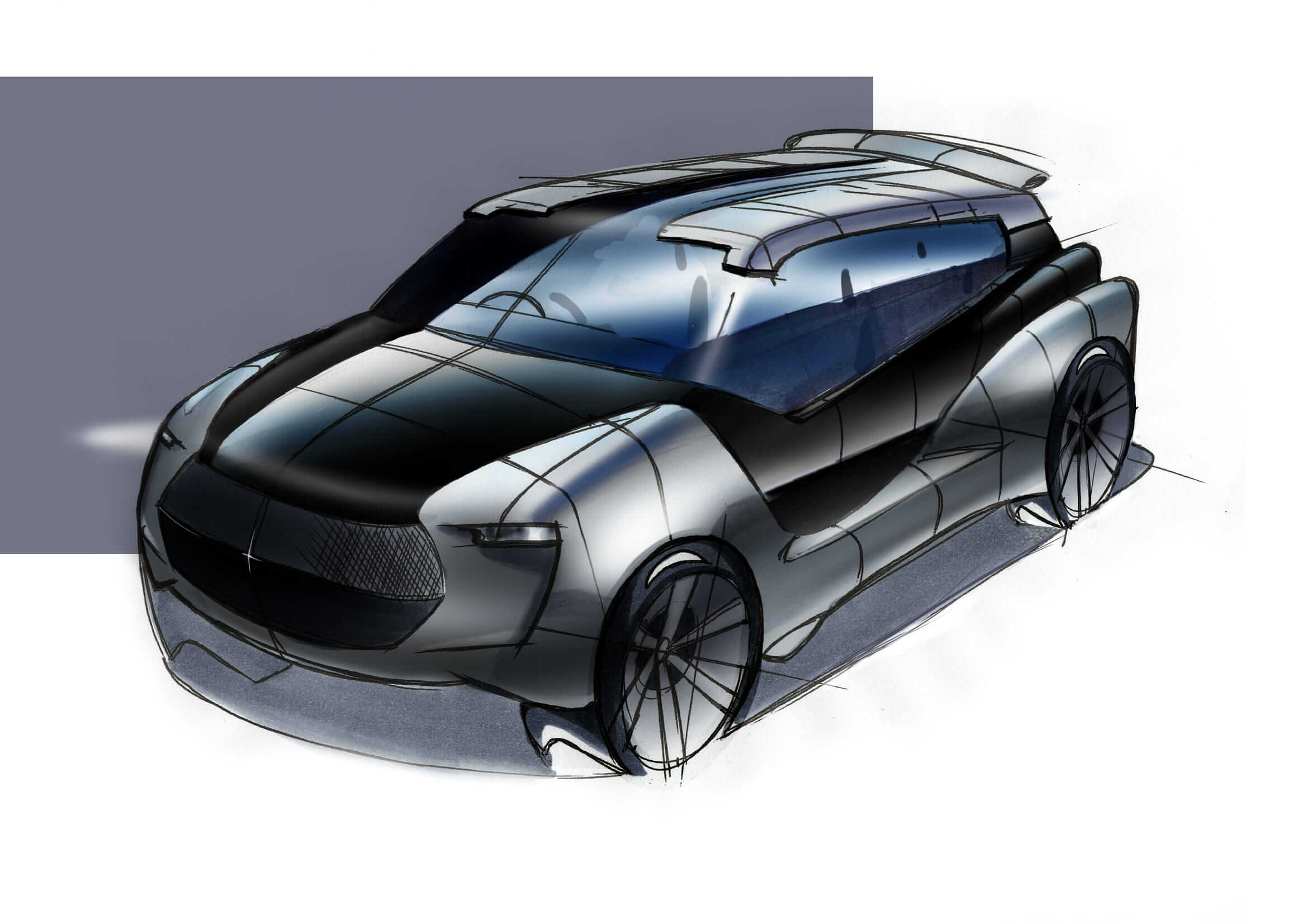
The inward slope of the cabin above the beltline is called the tumblehome. A-Pillar is a major component of cabin, which support the windshield glass. For beginners to express the slope of A-Pillar is a problem. A-Pillar has two inclinations. One is from front to rear. This one is easy to understand. The slope which many people ignore to express is the slope from side to center. Please look at the below front face sketch. You can see the cabin (where surrounded by windows) is inclined from side to center. It means A-Pillar slope has two aspects.
(excerpt from Car Design Academy teaching material)
In Car Design Academy, we teach students to get to know the car body structure in the early stage, Lesson 2. We ask students to draw objects which has a tumblehome in a simplified form. If you are interested in learning car design, please click the link here.


